


Optimizing your eCommerce website is not just something to be done while creating the website. If you run an online store, you will inevitably have to make some changes to it. This is not limited to the time shortly after you open your site: you will be adding, adjusting, or eliminating features and elements for as long as you want the site to keep going.
At least, you should be doing this. The alternative is never making any changes to your site, but that puts you at risk of stagnation. A website may boast about utilizing the latest versions of the most modern technologies upon their launch. However, if that same website fails to update their software and evolve with the times, they may end up losing ground to fresher and more adaptable competitors.
With that said, these changes do not have to be sweeping in their scale to produce a sweeping effect. They may be so subtle that the majority of visitors will not even note anything different about your website. However, they may still have a significant and positive impact on the experiences your customers have, and there are ways to measure this impact (other than asking customers if they noticed anything different).
One such change you can try out with your eCommerce website is one you have almost certainly seen but may not have even noticed, let along given much thought about. Here is some information on the sticky menu, a feature that can aid greatly in website navigation.
What is a Sticky Menu?
There are a few different ways you can arrange the contents of a webpage, including the menu. Many people simply place it at the top of the page, beside the logo, and place everything else under it. Others create a sidebar, or even one on each side of the page, with menu options. You can customize many different aspects of the menu’s design — for example, how people access the links within the different categories.
Source: w3cschools.com
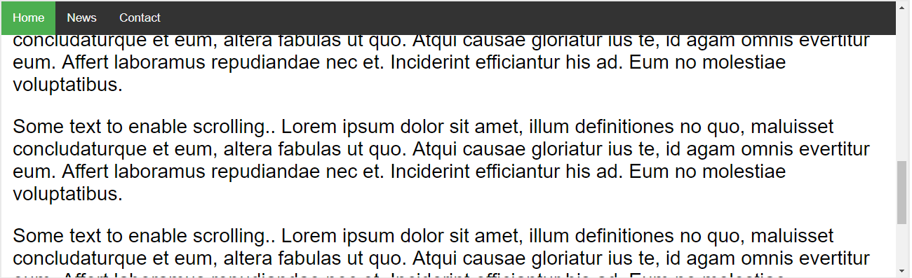
A "sticky menu" refers to a floating top navigation element that addresses yet another aspect you can customize with your menu: what happens to it when a visitor scrolls down a page. If a website’s menu is not “sticky,” then it will be treated the same as the text, images, sidebar links, and any other page elements: as soon as one scrolls down, it will disappear from sight. Anyone who may want to reach that menu must then work their way back to the top of the page.
If a website’s menu is “sticky,” then it will be permanently visible, or “stuck” in its designated area. Even if the visitor scrolls all the way to the bottom, they will still be able to see and click on the menu somewhere within the part of the page that is onscreen.
Why Website Navigation is Important?
Having an aesthetically attractive appearance and offering products for purchase are all important. However, perhaps the most important goal for the design of a website is to make navigation simple and intuitive. As a thought exercise, put yourself in the perspective of someone who has never visited your website before. If you encounter any trouble reaching the different sections of a site, would you not consider finding a competitor who can help you find what you seek with greater ease?
Luckily, there are many small touches people can add that can make their websites more user-friendly, including the implementation of a sticky menu feature. The idea is that having the menu available at all times will make it quicker and easier for people to surf the site. That way, they don’t have to put as much effort into navigating the page and searching for a link to another one. This is especially helpful if the page itself is massive, such as a lengthy blog post or a results screen.
Of course, making your website's navigation more intuitive is not itself a straightforward process. The sticky menu is just one of many tools you can use, and it handles just one of many aspects that you need to consider. With that said, it is one that is worth testing out, especially because of the many benefits it can provide your site.
Benefits of Implementing a Sticky Navbar
There is a rather simple logic to giving your webpages a sticky navbar. Sticky menus, as we described, make website navigation easier. People prefer user-friendly sites to more cumbersome competitors. This increases the chances that they will stay long enough to make a purchase, as well as the chances that they will return. This logic may sound too simple, and the same could be said about any feature that “makes website navigation easier.” However, eCommerce statistics supporting the positive impact of sticky menus does exist.
Faster Navigation and More Control
 Source: smashingmagazine.com
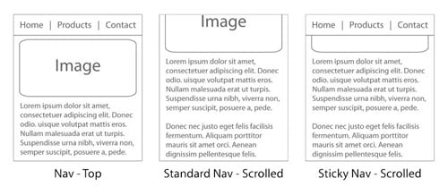
In 2012, user experience designer Hyrum Denney conducted an experiment regarding sticky menus for an article published in Smashing Magazine. He asked 40 participants to complete five tasks on two nearly identical test sites he created — one with “standard navigation” and one with sticky navigation. According to the data he collected, having the menu “stuck” on the screen at all times makes navigation 22% faster than letting it vanish after scrolling down.
This may be simply because your customers have control. People like any measure of control they can get over their website experience, even with something as simple as this. Clicktale also notes the effect that sticky menus have on confidence. They note that “visitors can feel lost trying to find their way through very long webpages,” and sticky menus enable them to “explore a page in a comfortable and controlled manner.” In particular, they note that older users are prone to a lack of confidence in their internet browsing skills, and they can use all the control they can get. Sticky menus help with that.
We can illustrate this with an analogy comparing website navigation to marine navigation. Using a website with traditional menus is similar to sailing on the open seas, with your browser’s scroll bar as the only way of orienting yourself as to how far you are from the menu. Having a sticky menu at your disposal is more like sailing close to the shore. With this feature, land is always in sight: you can swiftly and effortlessly move onto another page any time you want without having to look for the menu again.
Surprisingly High Customer Preference
Denney gained another interesting insight from his study: sticky navigation is far more popular than the typical form of website navigation. 34 out of 40 participants stated that they favored the site with the sticky menu. The remaining six gave no preference, meaning no one outright preferred standard navigation.
Best of all, it seems that the experiment yielded these remarkable results without anyone knowing. Denney did not inform anyone of the sole variation between the two websites and took further precautions to avoid bias. They worked surprisingly well: every single person who preferred the website with sticky navigation could not identify the difference between that version and the one without sticky navigation. The article quotes one participant as saying, “I don’t know how the websites were different, but I felt like I was spending a lot less time clicking with the first one.”
This indicates that the feature may be so subtle that most visitors would not identify it as a major factor of their site experience. Despite this, it clearly increased customer satisfaction in Denney’s experiment, and the same may well happen with your own eCommerce site.
In short, sticky menus make navigation quicker for customers and increase a website’s appeal, and both these benefits lower bounce rates and bump up customer satisfaction and conversions. All this is accomplished just by providing a simple fix to a problem that many people do not even know is a problem. What more do you need?
Best Practices for Sticky Menus
If you want to implement sticky navigation, there are several concerns you will need to address. Chief among them is how you will go about doing this.
Using iFrames may seem tempting, seeing that you can already use them for many aspects of website building. However, this risks lowering your search result rankings, limiting your site’s compatibility with different browsers, and even compromising security. Stick with CSS, which is still extremely simple to use and creates far less mess.
Designing the menu and its relation to the rest of the space on the page must also be approached carefully. You would be adding one more element to a page that may already be full of them, such as text, images, videos, and links. Most importantly, you need to consider whether they take up too much space from any advertisements you allow on the page — and whether both take up too much space from the content that the visitor is trying to see.
You should also decide if you want this feature to be active on your website in any screen size or only in specific sizes. Please note that because every site design is different, there is no general advice for when and when not to do this. With your site, a sticky menu may be feasible on a blown-up desktop ratio, or it may be cumbersome. Likewise, it may be unnecessary in a more compressed cell phone ratio, or it may be indispensable. Just consider your own situation, test it on different screen sizes, see how the results look, and tweak as needed.
Great Examples of Websites Using Sticky Menus
Vapor God
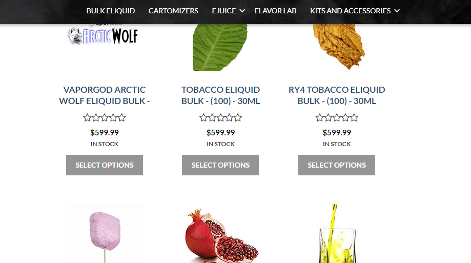
Vapor God, a vape online store, shows how to keep your menu flexible depending on where you are in the page. When you are at the top, you see the company logo with links on either side, as well as buttons for the shopping cart, search, and “My Account.” Under all that is a blue line, and under that line are five buttons for product categories. Only the links under the blue line remain as a sticky menu when you scroll down.
American Niagara
Similar to Vapor God’s approach, American Niagara also delineates the bottom row of links on their header as a sticky menu. These links let users navigate to other product category pages, the most essential parts for navigating a website. With that said, the rest of the header provides other tools and information that users might want, such as their phone number, a search bar, and the occasional promotion.
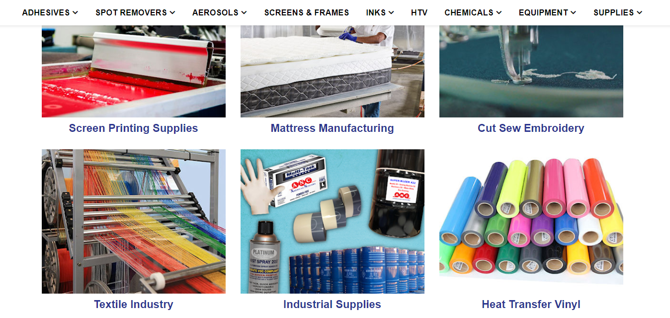
ESD Plastic Containers
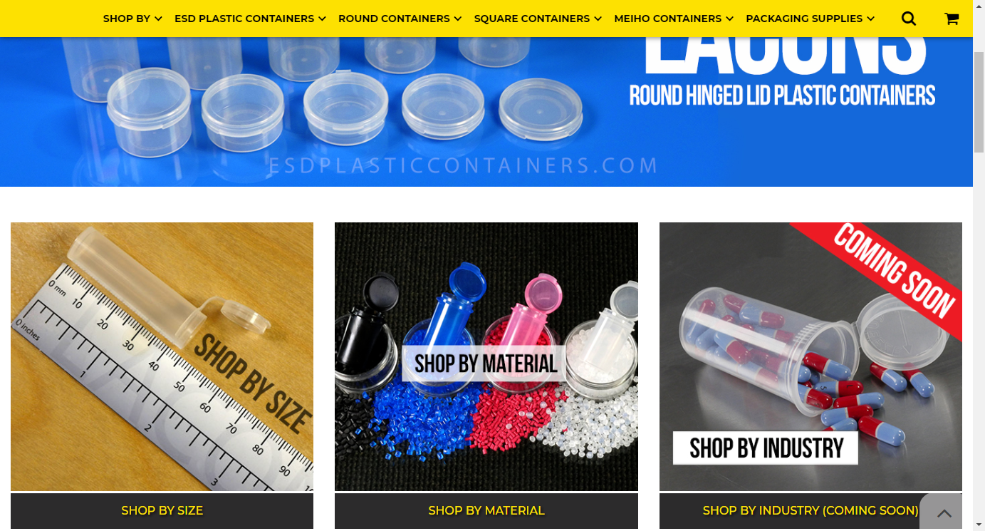
ESD Plastic Containers makes this separation between the header and the sticky menu clearest. Instead of being separated with a small and hardly noticeable line, the primary links are in a bright yellow bar. This strongly directs attention to them, even when visitors are still at the top of the page. More importantly, when you scroll down, the search and shopping cart icons are moved to this menu instead of disappearing with the rest of the header.
Anchor Express
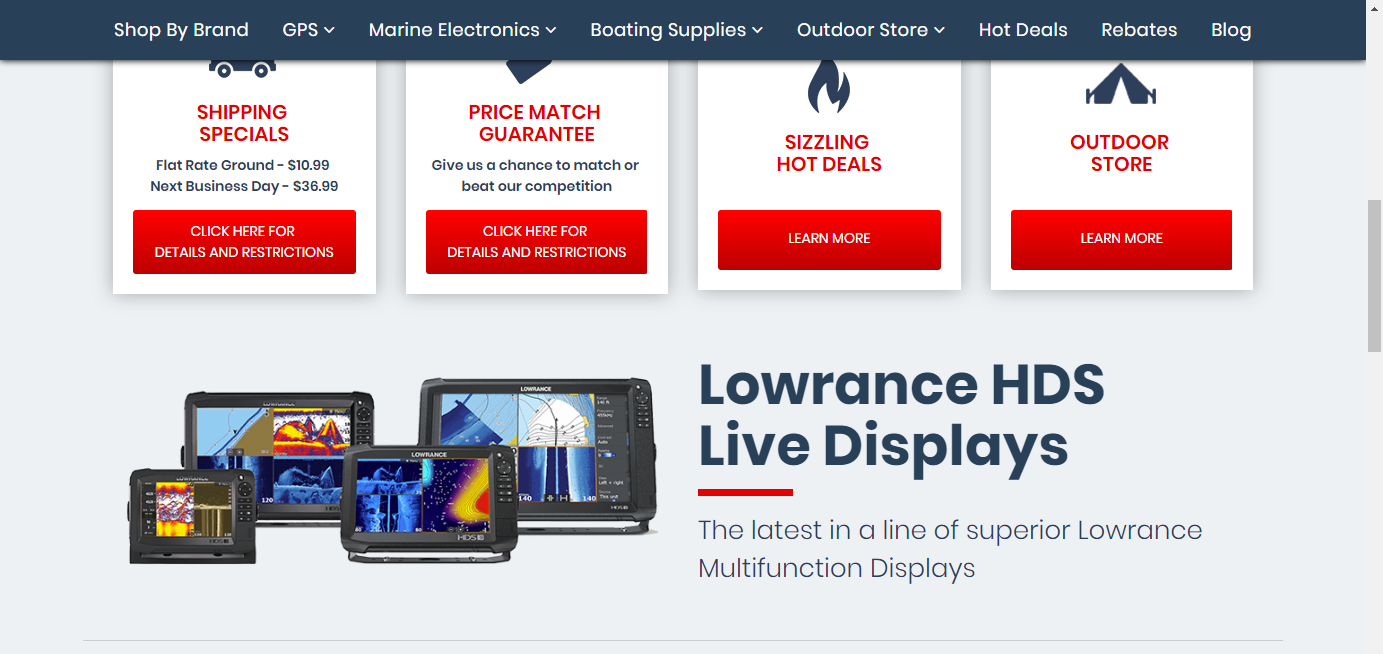
Anchor Express has multiple bars in their header, but only the last one is used for sticky navigation. It contains product category pages, as well as links to their blog, “Hot Deals,” “Rebates,” and “Shop By Brand.” Those pages may have a large assortment of products, paragraphs text describing them, and long lists of links. As a result, they can be quite lengthy, and the sticky menu comes in handy.
Buy Buy Baby
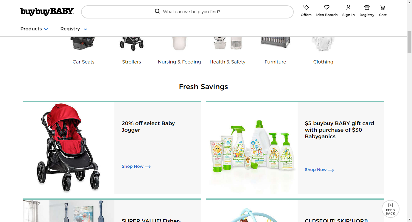
Curiously, Buy Buy Baby drops its bottommost options (drop-down menus for their products and registry) as you scroll down the page. This leaves you with the search bar and links related to the user, such as the shopping cart, account sign-in, and “My Offers.” They also leave the logo up, both as a link to their homepage and for brand visibility.
Walmart
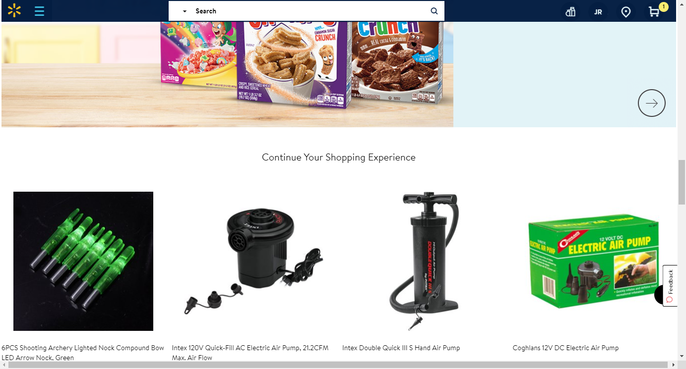
The biggest retailers in the world have long known the benefits of sticky navigation. The Walmart website’s sticky menu, running through the top of the screen. Aside from a search bar and the options you would expect to find, it has an icon that pulls out a “hamburger menu” from the left of the screen, which shows you all the departments and their subcategories. This gives users access to a horizontal and vertical menu.
AWD Agency
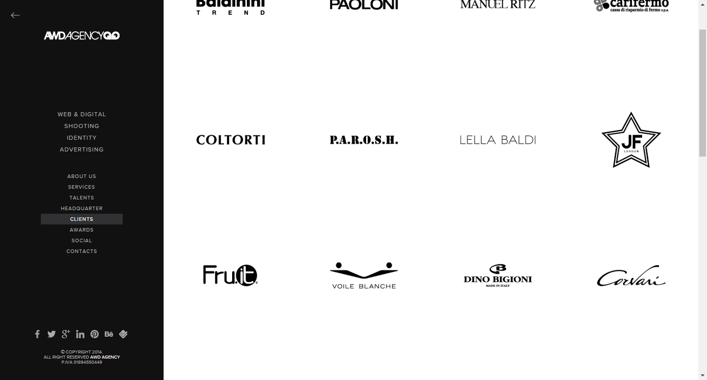
One example of a vertical sticky menu is AWD Agency, an Italian digital media agency. The main screen at default mode does not have any menu, allowing you to see only a sample of their professional photography. The left side of the screen has a bar with their logo. When you click on it, their menu pops out and stays out even as you scroll.
Facebook
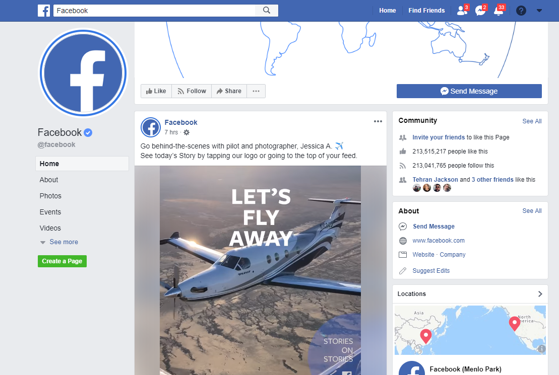
Facebook and other social media websites heavily depend on sticky menus. People largely use these sites by scrolling through a feed, and they can scroll a long way down without running out of new material. Having a menu permanently fixed on the screen means they do not have to stop scrolling if they want to see new notifications or hop to other parts of the site.
Sticky Navigation on Product Pages
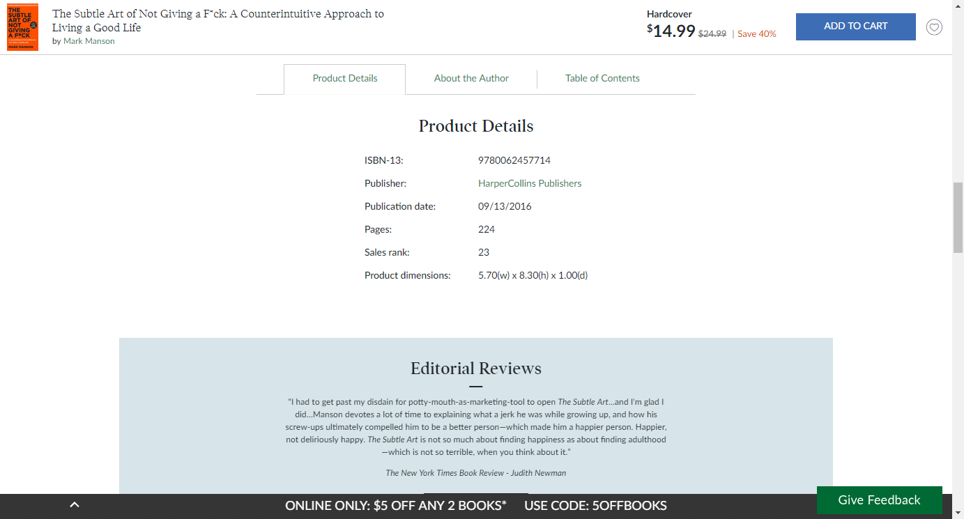
Product pages present you with another opportunity for clever and helpful use of a sticky menu. These pages can contain far more than just the name, price, and pictures. For example, the page for an item on Barnes and Noble will also contain product details, a summary of the book, reviews from critics and B&N customers, and more.
Another example is Direct Door Hardware, whose products come with detailed instructions for the functions of each item and installation.
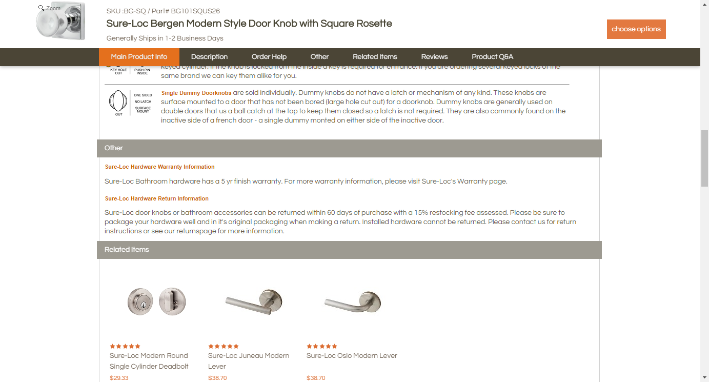
This information is all necessary, but it threatens to drown out the most important data: the name, price, and picture. With sticky navigation, you can keep these at the top of the page (as well as an “Add to Cart” button) instead of or along with the website’s major links. After all, the purpose of sticky website navigation is to keep the customers’ most-wanted parts of a website available to them. Applying this principle to product information is a no-brainer.
Summary
Sticky website navigation is becoming a staple of website building. Even if customers are not noticing the usefulness of the feature, web developers certainly are, and so should you. Not every website really needs a sticky menu, but anyone with an eCommerce store and an open mind should at least give it a whirl and test it on their site. You may be surprised by the positive results that such a simple change could yield.


Leave a reply or comment below