

For most business niches including Ecommerce email marketing has won the title of the most efficient channel due to its impressive ROI of $44 per every dollar spent. And the privilege of delivering your message directly to the customers’ inbox comes with many advantages.
For example, you can apply personalization on a much deeper level than in paid search or social media. You also get to reach the mobile audience that is becoming more active at purchasing directly from their devices. And best of all, email marketing allows you to build long-lasting relations, whereas other channels often suggest just a single-time interaction between the brand and the customer.
That privilege comes with a challenge too. Because to start an email marketing campaign you first need to build an email list, and many entrepreneurs find this part quite challenging.
The average email signup rate varies between 1% and 3% depending on the niche. And whether we’re talking about thousands or hundreds of visitors per day, when you think about how many of them leave without subscribing – you realize how much money is being left on the table.
In this article, we’re sharing 6 easy tactics to build an email list, and we promise you’ll be able to replicate them even if you’ve just started your online business and have zero experience at collecting emails.
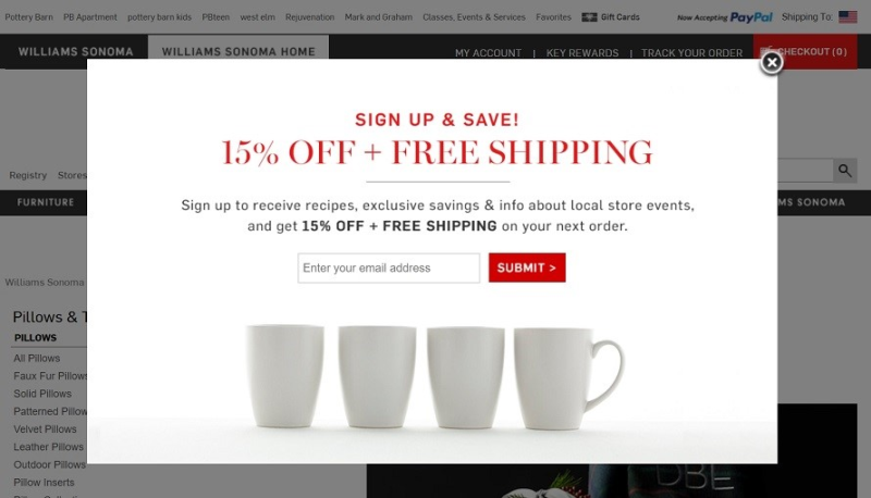
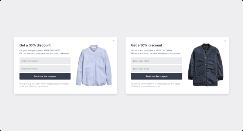
Williams Sonoma store offers first-time visitors a strong incentive to join the list
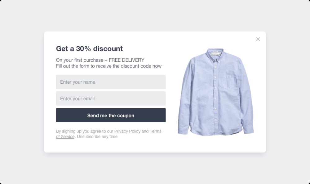
1. Offer the strongest incentive you can afford
Your customers’ inboxes are probably already flooded with promotional emails, so it is only natural that they are reluctant for yet another subscription – unless there is something, they’d be willing to trade an email for.
You can think of it as an ethical bribe or a so-called “lead magnet”, and the most popular lead magnets for Ecommerce are generous discounts, free shipping, or both. The main purpose of a lead magnet is to convert website visitors into subscribers, but when designed right – it can increase sales too. Of course, to make the concept work, it’s important for the offer to sound and look irresistible, so keep in mind that a 5% discount might not cut it.
From the technical standpoint, displaying and delivering a lead magnet is quite easy if you’re using signup forms on your website. For this article, we’ll be using GetSiteControl email subscription forms as an example, but there are many other tools that will help you achieve the same goals.
You need zero knowledge or special skills to create a popup. For instance, here is what the form builder dashboard looks like:
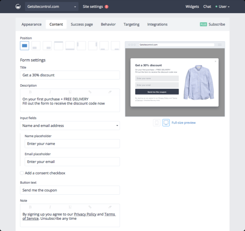
All you need to do is choose the incentive, write compelling copy and decide when and where you want the popup to appear. For example, you can have it displayed on every page of your website after a visitor spends some time scrolling the content. Or you can add it to the selected pages and set an exit-intent trigger to convert those who were about to leave. We’ll talk about these tactics later in the article.
Do deliver the promised lead magnet – or a discount coupon code in this case – you can set up an autoresponder feature. It’s an automated message every new subscriber receives via email after filling out the form.
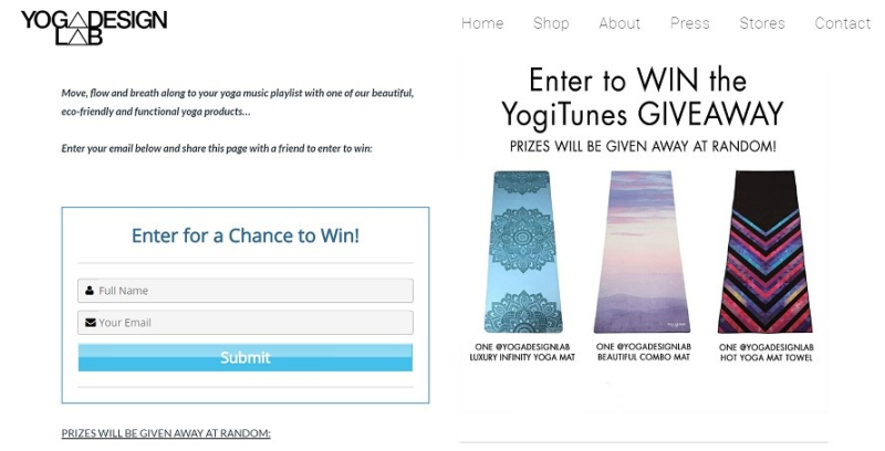
Yoga Design Lab runs a giveaway to collect email addresses
2. Run a giveaway or a contest
Everybody loves sweepstakes, and you can easily tailor one to quickly build an email list just like Yoga Design Lab from the example above.
Giveaways have many advantages. They are easy to host, easy to promote, and the volume of emails you will receive may even exceed your expectations even if you’re not a large brand. For example, a small Dutch cosmetics company named Trind collected 930 new emails in just 2 weeks when they ran a manicure set giveaway in 2016.
From the practical standpoint, you can arrange a giveaway on your website, on your social media or both. First, you can announce it using popups, slide-in, or floating bars we mentioned earlier. Describe the giveaway right on the subscription form and encourage visitors to fill it out right away or use a call to action popup to lead them on a dedicated landing page.
If you decide to host social contests on a regular basis, consider the apps designed for it. Rafflecopter, Gleam, and Woobox are just few examples. Apart from collecting emails, they help you choose the winner, fine-tune the participation requirements and embed the form on your social media.
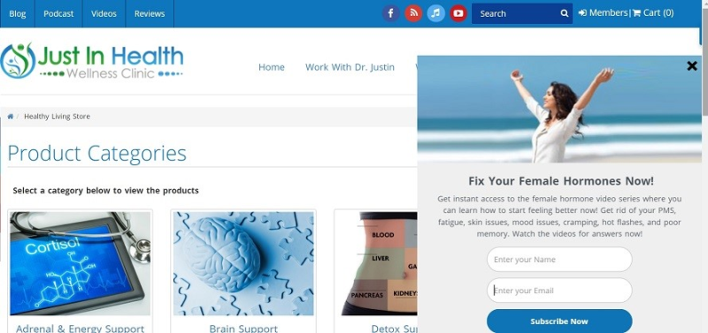
Just in Health collects emails by offering the content relevant to their customer persona
3. Use content upgrades
Content upgrades are another incentive to subscribe for people who may not be ready to make a purchase right now – and therefore not so enticed by a discount. Yet given they have landed on your website, they might be still interested in what you have to offer. Use that assumption to capture their emails in a more sophisticated way.
If you already use content marketing to attract a new audience to your website, that should be an easy task for you. If not – it’s time to get creative. Depending on the niche your products belong to, think of a few pain points your audience may be trying to solve right now – and offer a solution in a form of a lead magnet. For example, if you’re selling healthy lifestyle related goods, you may prepare a list of 5 healthy lunch recipes on a budget, a 30 days healthy living cheat sheet, or even a fitness calculator designed in an excel file.
You got the idea. And don’t think your lead magnet has to be an eBook that will take much time and effort to prepare. On the contrary, people are typically happier to receive bite-size digestible pieces of information they can apply to their problem right away.
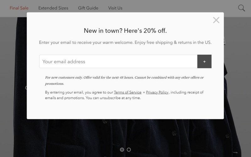
Bonobos tempts first-time visitors with a 20% discount after they spend a few seconds on a page
4. Strategize signup form placement and targeting
You’re probably thinking: should I place those email signup popups on every page of my website and should they all look the same? The answer to both questions is: probably, not.
Picture your customer journey and identify the key pages a visitor goes through. Chances are, your home page, landing page, category and product pages receive the highest volume of traffic – and of course, you want to convert it. So, placing your best incentive-based subscription popups there is essential.
Now, you should also take into consideration that some of these pages might be visited by the new and returning customers. Clearly, your goal is to actively convert visitors the first time they are on your website – simply because there’s no guarantee they will come back. It doesn’t mean, however, that you should not include returning non-subscribers to your strategy. In fact, you might want to try a different incentive to convert them at the second attempt.
Finally, you can use the elements of personalization and show customized forms based on such parameters as user language, location, websites they come from, and more. For example, if you expect traffic from a blog you’ve partnered with, mention the name of the blog in the copy and create a custom coupon code to make your visitors feel special and welcomed.
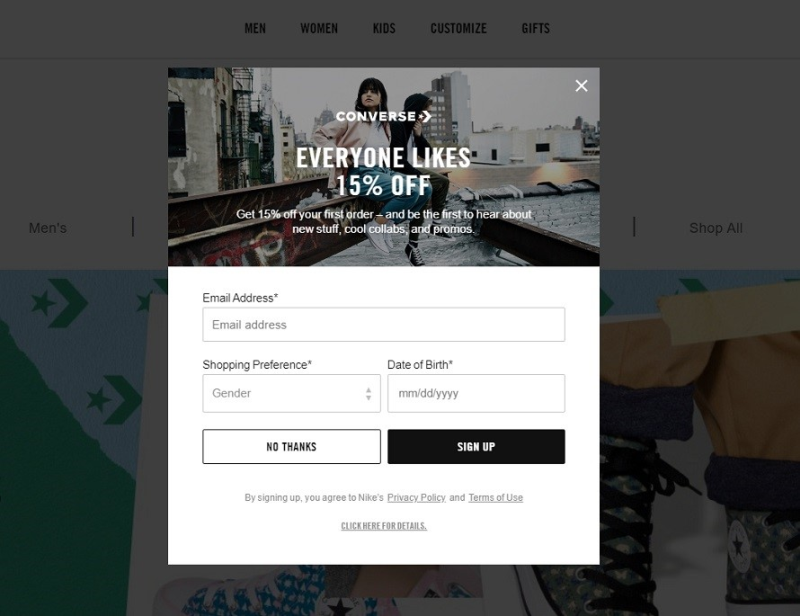
Converse uses the exit-intent technology to convert abandoning visitors with a 15% discount offer
5. Convert them right before they exit
It’s hard to underestimate the exit-intent technology because it’s the only way you can actually convert those visitors who were leaving your website to never come back. If you haven’t heard of exit-intent popups, here is how they work. The app you use to display popups tracks user mouse movements and shows your offer exactly at the moment their cursor gets close to the X button.
Exit-intent popups can help you reduce website bounce rate and even decrease cart abandonment.
Now, keep in mind that this is literally an interruption of user experience, so here are a few tips on how to make exit-intent popups work without annoying website visitors. First, you should never display them to those who have already subscribed to your newsletter. Second, your value proposition should be communicated very clearly – remember, you’re stopping an abandoning visitor who doesn’t want to spend time on your website anymore, so get to the point quickly. Finally, make sure your offer is truly worth their attention. After all, there is a difference between trying to convert someone browsing your website for X minutes and changing the mind of a person who has already decided to leave.
If done right, exit-intent popups allow you to kill two birds with one stone. Best case scenario, you get a new subscriber and if the offer is enticing enough – you get the order placed, too.
6. Place a floating bar on the top or the bottom of the page
Popups are great at email list building but relying on them solely would be a mistake. Some of them will be impulsively closed by the visitors, some of them simply won’t produce the right effect at first sight. So apart from nudging your audience to subscribe with slide-ins and modals, you might also want to have a permanent signup form on your website that will always be in sight, yet in a non-distractive manner.
Consider floating bars placed at the top or the bottom of a webpage. They provide you with enough space to place a call to action and visitors can fill them out whenever they want to. The best practice here is mentioning the same incentive you’d use for a full-size modal.
Between a lightbox popup and an old-school static subscription form embedded at the very bottom of the page (where most people never scroll to), floating bars are the golden mean. And they work well combined with other tools and tactics you decide to use. For example, the Buffer team published a chart showing that a floating bar brings 33,5% of all signups.
Final thoughts – test your assumptions
No matter how well your email subscription forms are performing, there is always plenty of room for optimization. And instead of doing the guesswork, you can rely on the good old A/B tests available in practically any popup builder. The above-mentioned GetSiteControl allows you to test up to 5 variations of the same form simultaneously.
Here is what you can test:
- creative, copy,
- call to action,
- form placement, incentives,
- on-page behavior triggers,
- and anything else.
Are people more inclined to engage after spending 5 seconds on a webpage or scrolling down 60% of your content? What’s more enticing – free shipping or 20% off? Will a GIF bring you more subscribers than a still image? You can find answers to all these questions if you run an A/B test. It will take you some time, of course, but the results will help you visibly increase email sign-up conversion rate in the long run.
What do you think is the most efficient way to quickly collect email subscribers for an Ecommerce store? Have you tried any of these tactics? Let us know in the comments below.


Leave a reply or comment below