

Close your eyes.
- Think of Coca Cola? What do you see?
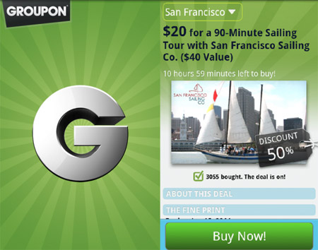
- Think of Groupon? What do you see?
What came to mind? A Logo? A Slogan? An experience?
Most likely, one of the companies visuals popped into your head. While looks aren't EVERYTHING, your store's appearance is your customer's first impression of your brand and as you probably experienced, looks can make a lasting impression. Both Coca Cola & Groupon have simple logos, but incredibly memorable ones.
Why? Bold colors!


While you don't always NEED to have bold colors to be memorable ( we love a good minimalist design), choosing bold colors for your store or logo definitely helps you make an impression. BUT using the wrong color combination can make your brand seem ameatuer.

Image courtesy of logodesignerblog.com
If you are trying to figure out the right combination of colors for your brand, look no further than KISSMetrics's color coordination cheat sheet!
.

Source of this Infographic


Leave a reply or comment below