

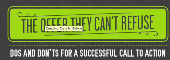
Email marketing is an essential element in eCommerce marketing and but has never been called easy. And one of the most important parts of a successful email campaign is the 'call to action' - the message that drives readers to the response you want them to complete. Writing an effective 'call to action' is part skill, part science. That's when we saw this extremely informative infographic from the guys at Litmus.com, we knew wanted to share.
There was so much much useful information, we wanted to break it down bit-by-bit.
Don't be selfish. Motivate.

The infographic says it perfectly - "a really great CTA will balance your needs alongside the needs of the subscriber." Your CTA should call your subscribers to fulfill your goal of the campaign ( make goals specific as possible) as well as give the subscriber a reason to preform the desired action. "Click to buy this bike" is too selfish and ultimately ineffective especially when compared to motivating CTAs like "Click to receive a 25% discount on this bike.
The infographic lists 10 important elements of a successful CTA.
1. People Like Buttons & 2. When it comes to language KISS

When it comes to form there are no wrongs and rights ( so test yourself), but traditionally in studies, CTA buttons do better than text links. Even more than web copy, Keep It (Even) Simple(r) Stupid. Your CTA should be plain, simple and obvious. Tell your subscribers EXACTLY what you want them to do. If you don't your Call To Action because a Call To ? <- they know you want them to do something, they just can't tell what, or why (not good).

3. Be engaging. Support your CTA
Like every type of marketing you do, be engaging. Be interesting and your readers will be interested (in your CTA). Its common sense, but it is also rare. It takes skill & time to make marketing material interesting, but it is worth it.
Also, all of your content should point back to your CTA both in design & context. Elaborate on your CTA, provide more detail to give your subscribers a fuller understand of your CTA and more of a reason to fulfill it. It's also important to make sure that all elements are secondary in terms of design focus to your CTA.
You can also use a tool like Rebrandly URL Shortener in order to track how your CTA's perform
4. Show importance with size.
Make sure your CTA is the biggest text & the biggest element on the entire email.
Size of elements and text tell subscribers what is important, so make sure you are signaling that the CTA is the most important.
5. Be pretty.
It SHOULD go without saying that your email should be pleasing to eye, but it doesn't. The truth is most emails are either ugly or boring. Humans are visual creatures, attracted to appealing images and colors so make sure you concentrate on your color palette just as much as you do content. Sometimes even the most convincing of words are not as effective as a beautiful email.
6. Always above the fold.
Just like color & size indicates to your reader what is most important, so does your placement. Your CTA should always be above the fold and if possible, should be the first thing your readers see. Placing your CTA at the bottom is too risky - what if a reader never gets there? Make sure if they open your email, they see the most important element - the CTA!
7. Repeat, Repeat, Repeat & Link, Link, Link
If your message is important repeat it & link to it. throughout your email. Make sure that your CTA is not the only linked element in your email, but don't go link-crazy because you'll look spammy.
8. Give your CTA room to breathe.
Whitespace is your second most important design element to your CTA. Good design allows the most important elements to breathe, allowing the viewer to take in one element at a time.
9. Show them the sign.
Just like in web design, icons in emails provide helpful cues to readers. Include your add to cart button, social buttons and any other button you think is helpful & recognizable to readers. In fact as the infographic shows below. A/B testing has shown that using an icon such as an arrow can up click -through rates.

10. Protect your email.
Image-blocking is common, so make sure you use a 'bullet-proof' button - a HTML text, background color and background images to create an image-blocking proof email. Also make sure you use a second-layer or defense - your ALT text, which will show up when your images have not been loaded.
Here's the infographic in its totality:


Leave a reply or comment below